Documentation
Useful HTML Snippets
We have built several standard UI components that we use in our apps and that are shipped with Kaiten. In order to use it, you just need to produce the correct HTML markup.
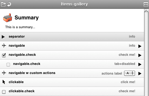
The following screenshot groups all this UI components in one single panel but we will explain each of them individually.

Summary Item

<div class="summary">
    <img src="/path/to/factory-32.png"/>
    <div class="label">Summary</div>
    <div class="info">This is a summary...</div>
</div>
Separator Item

<div class="items separator">
    <div class="head">
        <img src="/path/to/arrow-black.png"/>
    </div>
    <div class="label">separator</div>
    <div class="info">info</div>
</div>
Navigation Item

<div class="items navigable">
    <div class="head">
        <img src="/path/to/airplane.png"/>
    </div>
    <div class="label">navigable</div>
    <div class="info" style="max-width: 375px; display: block;">info</div>
    <div class="tail"><!--required container--></div>
</div>
The following are managed by Kaiten, so you don't need to do anything.
It is worth to elaborate a bit more on navigation items because you are likely to put some magic on them (see Connectors), in order to load panels when the user clicks on them.
Kaiten understands that and add some sugar features.
When the user rolls his/her mouse over your navigation item:

When the user clicks on your navigation item:

When a panel loads Kaiten automatically applies a "focus" class on the first navigation item it finds. This gives a clue to the user if he/she uses the navigation keyboard shortcuts.

Navigation Item with checkbox

<div class="items navigable checkable">
    <div class="head">
        <input type="checkbox" checked="checked" value="" name="" class="input-checkbox no-nav"/>
    </div>
    <div class="label">navigable.check</div>
    <div class="info" style="max-width: 338px; display: block;">check me!</div>
    <div class="tail"><!--required container--></div>
</div>

